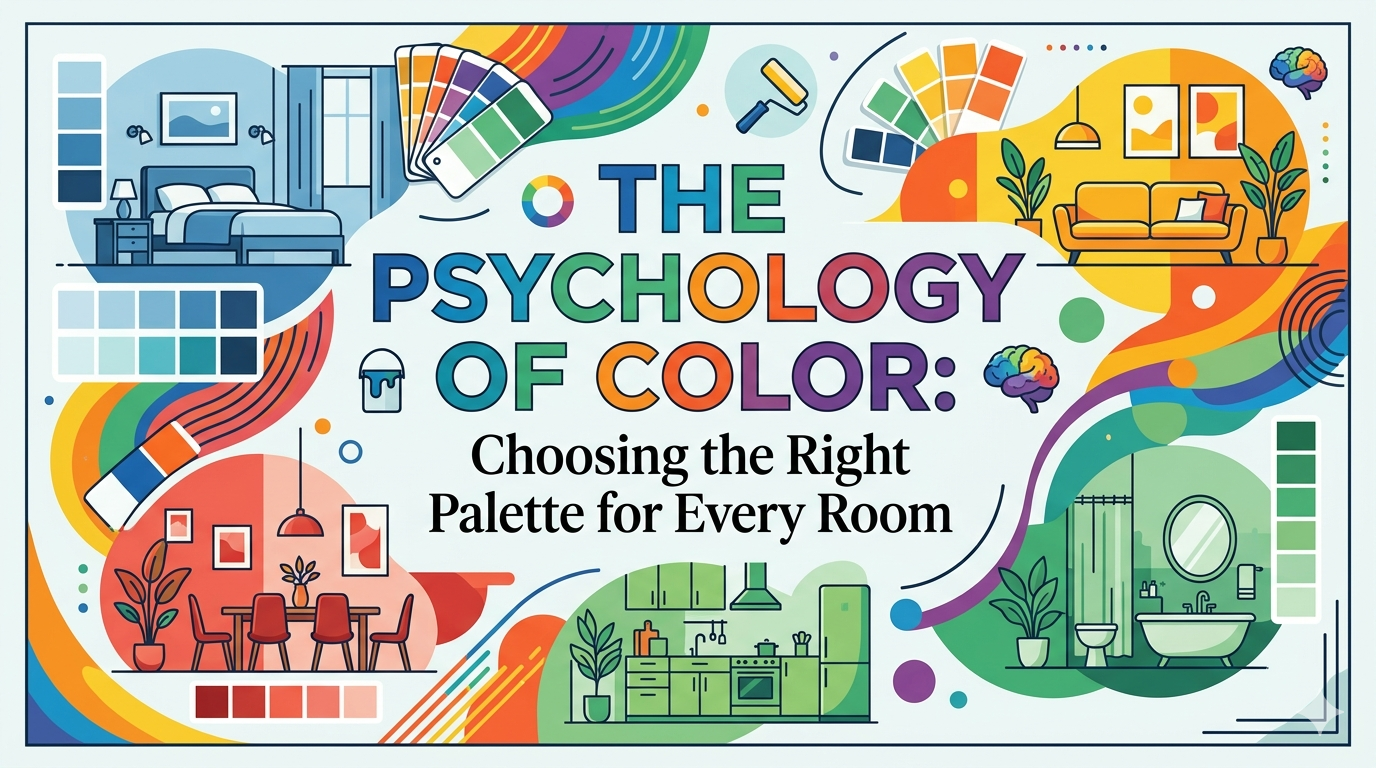
The Psychology of Color: Choosing the Right Palette for Every Room
Have you ever walked into a room and felt an immediate sense of peace? Or perhaps you have stepped into a space that instantly made you feel more alert and talkative? This is not a coincidence. It is the silent, powerful influence of color psychology at work.
When we design our homes, we often focus on furniture and layout. However, the colors we choose for our walls do more than just look pretty. They set the emotional tone for our daily lives. Choosing the right palette is about more than following trends; it is about creating a feeling.
The Sanctuary: Why Blue and Lavender Belong in the Bedroom
The bedroom is your personal retreat from the world. After a long day, your brain needs a signal that it is time to switch off. This is where soft, cool tones shine.
Light Blue is scientifically proven to lower the heart rate and reduce blood pressure. It mimics the stillness of a clear sky or a calm ocean, making it the ultimate shade for deep sleep. Similarly, Lavender provides a sense of serenity without the coldness that some darker blues might carry. These colors do not demand your attention. Instead, they give your mind the space to drift away.
The Heart of the Home: Energy in the Living Room
The living room is a completely different beast. This is where stories are shared, guests are entertained, and the family gathers. For this space, you want colors that stimulate conversation and connection.
Bright, warm tones like Soft Yellow or Terracotta can make a room feel sun-filled and welcoming. If you prefer a more modern look, consider a bold accent wall in Deep Teal or Warm Grey. These colors provide a backdrop of energy and sophistication. Unlike the bedroom, where we want the energy to drop, the living room thrives on a palette that feels alive and inviting.
The Balance: Nature in the Workspace
If you have a home office, consider Green. As the most common color in nature, green is easy on the eyes and helps with long-term concentration. It strikes the perfect balance between the calmness of blue and the energy of yellow, keeping you productive without feeling stressed.
Your Home, Your Rules
While psychology gives us a roadmap, the most important factor is how a color makes you feel. A color that reminds you of a happy memory will always be a good choice. Paint is one of the most transformative tools in interior design. Do not be afraid to experiment until your home feels exactly like the person you are.